
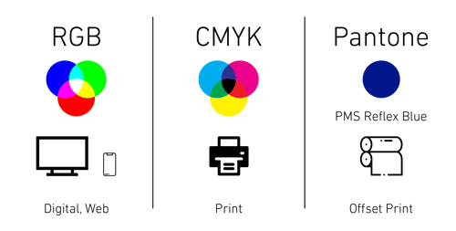
What you see on screen is not always how it will print. Did you know that PMS Reflex Blue (Royal Blue) prints Purple when produced as CMYK? It's the heavy amount of Magenta in the color's CMYK breakdown causing it to shift Purple.
Here at ICC we truly offer a wide range of products and services for your business. Which means for most of our clients, we not only manage their copiers and printers but also their printed materials like business cards and promotional items. So, it’s safe to say that we know a thing or two when it comes to printing. But it doesn’t take an expert to know that the most important aspect of printing is color. Color can add life to a dull sales report, emphasize the potential harms on a product label, and even make or break a business. Millions of marketing dollars have gone into creating a brand’s color, as it is the one aspect that is incorporated into every part of their marketing strategy. Some companies even go as far as trademarking a specific color. However, as experienced marketers and graphic designers will tell you, sometimes a color does not always look the same. I’m not just talking about varying shades like light blue versus sky blue either. Instead the very same color can appear different all depending on the color gamut that was used to recreate it. Sound confusing? Fret not, you are reading the right article because today’s blog post will be diving into the complex world of color to shed some light on the three most common color gamuts as well as their main uses.
Yellow is Not Yellow
—
But first things first, how can the same color appear different and what is a color gamut? A color gamut is the entire range of colors and tones achievable by an imaging system. The term may sound unfamiliar but I am sure you probably know a few gamuts yourself, but you probably know them as “CMYK” or “RGB.” Still Lost? Think back to your elementary school days when you learned about prime colors; red, yellow, and blue. By mixing red and blue together you made the color purple. Blue and yellow make green, red and yellow make orange, and so on. Thus a color gamut is every single-color palette derived from a set of primary colors. The only problem is not every system uses the same primary colors, which brings us back to the question of “What causes a color to print one way but appear on the computer screen another?” This is a common question we hear from our clients, especially if they are having their logo printed for the first time. As mentioned earlier in this post, the two most common color gamuts are RGB and CMYK. RGB (Red, Green, Blue) is the color gamut for computer screens, and has the widest range of color. These colors are additive. CMYK (Cyan, Magenta, Yellow, Black) is the most common color gamut used for printing, sometimes it is referred to as “Four Color” or "Full Color" since it has four primary colors. These colors are subtractive. Now because every color on a particular gamut’s spectrum is ultimately a mixture of the primary colors, RGB does not have a true yellow. This brings up a lot of interesting points, like for starters that this picture of a banana is not really yellow.

But brands with yellow logos may notice a distinct difference in the color of their logo on a screen versus if it was printed. Another example of how the same color can appear different can be seen by comparing these two ICC logos.
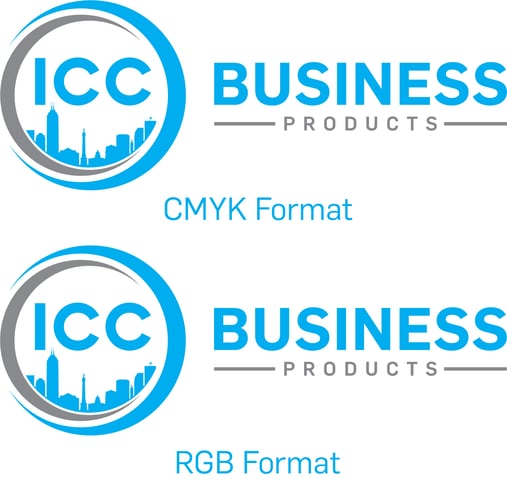
ICC’s brand color is 100% Cyan, a shade of blue, yet it even appears slightly different in RGB format. Although the difference in color modes is usually the main reason why your color may not turn out the way you have planned, there are still other factors that can also have an effect.
The Common Mistakes
—
They say variety is the spice of life, but when you’re trying to ensure that your color always appears the same there are a few things that you need to take into consideration. The first is that screens and even printers have just as much variety as color gamuts do. Yes, even the brightness, contrast, and other display settings on your screen can result in some variation in how certain colors appear. Let’s go back to that picture of the bananas for another fun example of this phenomenon. Take a second to look at the banana, now go ahead and change up your contrast setting on your screen. Simply by changing the setting, you will begin to notice that the banana begins to change color as well. The same concept holds true for printers as well. Each printer has their own unique calibrations set up for their machines, and thus the color on two CMYK printed items from two different printers can differ just like the bananas on your computer screen. It is for this reason that I would advise you to try and consolidate your printing purchases down to one vendor. That way you can limit the chances for variation as all your printed materials will be run with the same calibration.
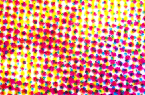
Another common mistake you should keep an eye out for when printing is called an “overprint.” An overprint can occur if you have accidentally set certain objects to print on top of each other as multiple layers in your artwork. Because of the multiplier layers, the printer actually reprints over the same area multiple times causing the inks to blend together. Remember that CMYK works by mixing the four primary colors together in a specific ratio to recreate a certain shade. If you were to take a microscope to a CMYK printed item, you would truly see the microdots of each primary color working together to trick your brain into seeing a certain color.
However when the printer overprints an image, it changes this ratio and thus your color changes as well. This mistake is especially tricky because it is easily overlooked as it only occurs during the actual CMYK printing process.

Even though the ICC logo appears normal on my computer screen, if it was printed as an overprint the art would have a drastic change in appearance.
Pantone Perfect
—
Right about now you are probably feeling a bit more confused about the world of colors in print and digital marketing than when you started reading this article. If RGB is the main color gamut for screens and CMYK is the main color gamut for printing, then how can you ever ensure that your color remains the same across platforms? Well the good news is that you are not the first person to wonder this and you most certainly won’t be the last. However there is already a solution for this issue and it comes from a company by the name of Pantone. Pantone; also known as Pantone Matching System (PMS), is actually a company that has created a system that allows you to convert from RGB to CMYK without fear of variation.
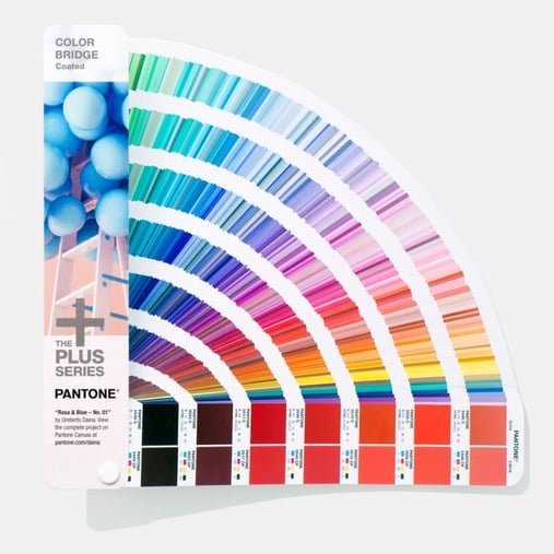
The Pantone Color Matching System ensures that manufacturers all around the world can refer to the exact same color and feel confident in their matching ability, despite never coming into direct contact with one another. Unlike the other two color gamuts discussed in this blog, Pantone uses 13 primary colors and thus boasts a total of over 1,800 different colors including metallic and fluorescent colors as well. PMS matching can also be used to create spot colors. Spot colors are created without screens or dots, the method used in CMYK printing. Spot colors are specifically mixed from a range of solid inks, which tends to make them cleaner and brighter than colors created using a four-color process. Their purity and consistency make them well-suited for applications like corporate logos and identity programs, where even slight variations in color must be avoided.
Colors can be confusing, especially when you start mixing color gamuts. Hopefully this blog has helped clear up some of that confusion. If not, then here are the main takeaways for your review.
Main Takeaways
- RGB is the color gamut primarily used for digital formats
- CMYK is the color gamut mainly used in print materials
- CMYK cannot produce Metallic or Neon Colors
- Pantone provides a standardized system for Color Identification and Matching
- Pantone shades can be converted to RGB or CMYK
- Offset printed products cannot use PMS colors
- The banana on your computer screen is not really Yellow
Regardless of which method works best for your marketing needs, you can count on the print specialists at ICC to help guide you throughout the purchasing process!
Still in the mood for reading? Check out our blog to read other interesting lists and insights into the business world.

